
LOUIS™ — THE ALCHEMY OF OPTICAL REFRACTION
Brand Identity, Custom Typography & Packaging System — 2025
LOUIS™ is a contemporary nocturnal botanical aperitif and Ready-to-Drink (RTD) series born at the intersection of wild monastic herbology and sensory distortion. Moving away from the ornate, predictable tropes of traditional heritage spirits, the brand establishes an obsidian-dark, hypnotic territory where chemical precision meets liquid surrealism. Every visual asset is conceived as an optical refraction through heavy cut glass—turning the act of pouring and tasting into a nocturnal ritual
CLIENT: LOUIS™ Botanicals (Conceptual) · DELIVERABLES: Strategy, Visual Identity, Packaging & 3D Art Direction · YEAR: 2025
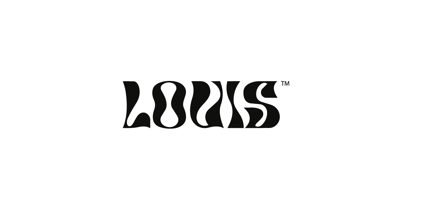

BESPOKE WORDMARK & THE GEOMETRY OF DISTILLATION
The visual identity gravitates around a custom-engineered display logotype with high-contrast, fluid serifs. While the outer silhouette evokes root structures and liquid motion, the negative counterspace inside the letter "O" is mathematically constructed as an organic hourglass—symbolizing slow botanical maceration and the essential drop. This expressive centerpiece is anchored by a strict Swiss typographic grid, pairing technical neo-grotesque headers with industrial monospace specifications (24% ALC./VOL., batch telemetry, and extraction metrics).


LABEL ARCHITECTURE & INFORMATION HIERARCHY
Designed with editorial rigor, the label architecture strips away visual noise to let materiality speak. The structural dieline divides information into two clear planes: an iconic focal zone dominated by the LOUIS™ mark in high-opacity Raw Parchment (#F4F1EA) over Obsidian Black (#050505), and a perimeter technical belt containing fermentation logs, botanical origin coordinates, and tamper-evident neck seal calibrations.


TACTILE MATERIALITY & THE RTD TRILOGY
Physical touch is fundamental to the LOUIS™ experience. The 700ml apothecary amber bottle is wrapped in 300gsm unstructured black cotton paper, treated with deep blind debossing, tactile silkscreen ink, and micro-stamped metallic foil. Expanding the brand into contemporary consumption moments, the 250ml matte-black sleek cans translate the recipe into three color-coded botanical expressions:
N°01 - BITTER CITRUS: Charred blood orange peel, gentian root & cinchona (#D9381E).
N°02 - HERBAL ABSINTHE: Wild wormwood, green anise & crushed fennel (#8FD14F).
N°03 - SMOKED ROOT: Roasted dandelion root, black cardamom & mineral tonic (#D8D8D8).


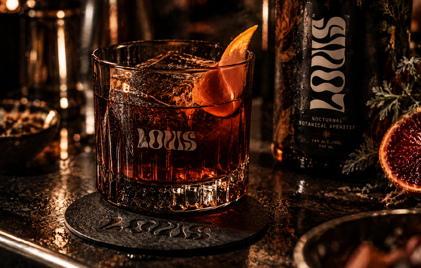
BRAND WORLD, SECONDARY PACKAGING & SENSORY RITUAL
Beyond the primary vessel, the visual system scales across structural micro-corrugated matte cardboard carriers, custom acid-etched heavy rock glassware, and high-density pulp coasters. Art direction for the botanical still-life series uses fluted and distorted glass prisms in front of the camera lens—physically replicating the liquid typography of the logo within the photography itself.


BEHIND THE CRAFT — VECTOR RIGOR & 3D PRODUCTION
From initial Bézier curve plotting to final 3D studio rendering, every detail was engineered to bridge graphic design and industrial production. Custom shaders were developed to accurately simulate the light absorption of wet cotton paper against dark amber glass, paired with procedural water condensation meshes and volumetric rim lighting to achieve hyper-tactile photographic realism.


CREDITS & PROJECT SPECIFICATIONS
Creative Direction, Brand Identity & Custom Typography: Harrynson Ramirez (Trento Studio) Structural Packaging & 3D Product Visualization: Harrynson Ramirez