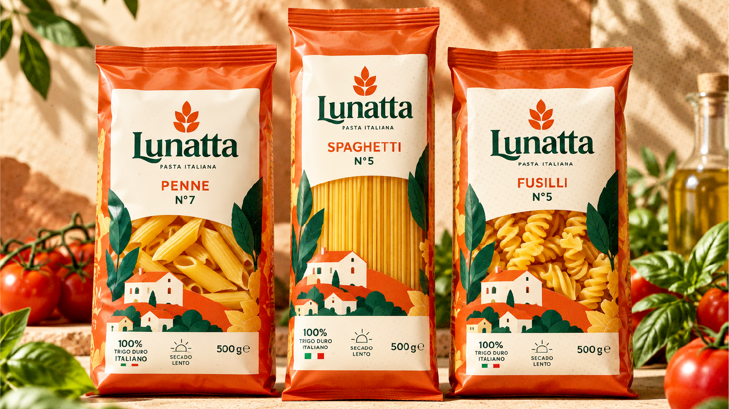
LUNATTA • Identity & Packaging System
Authentic Italian Heritage Reimagined / La tradición italiana reimaginada
Lunatta was born to honor the timeless craft of traditional pasta making. Rooted in Mediterranean gastronomy, the identity balances rustic warmth with contemporary shelf distinction—celebrating pure ingredients, honest culinary rituals, and the joy of sharing around the table.
Project Overview
The objective was to build a comprehensive brand identity and packaging architecture capable of standing out in competitive retail spaces while staying true to artisan roots. Drawing inspiration from warm terracotta hues, golden wheat fields, and classic Mediterranean countryside landscapes, the system combines disciplined typography, tactile packaging finishes, and rich culinary storytelling across both print and digital touchpoints.
Project Credits
Client: Lunatta Pasta Artigianale
Discipline: Brand Identity, Structural Packaging Design, 3D Visualization, Art Direction
Sector: Food & Beverage / Gourmet Packaging
Year: 2026
Lunatta — Authentic Italian Heritage
Lunatta embodies the warmth, craft, and passion of traditional Italian culinary culture. Designed with a timeless typographic approach paired with a distinctive wheat-inspired icon, the brand reflects authenticity, purity of ingredients, and an invitation to gather around the table.
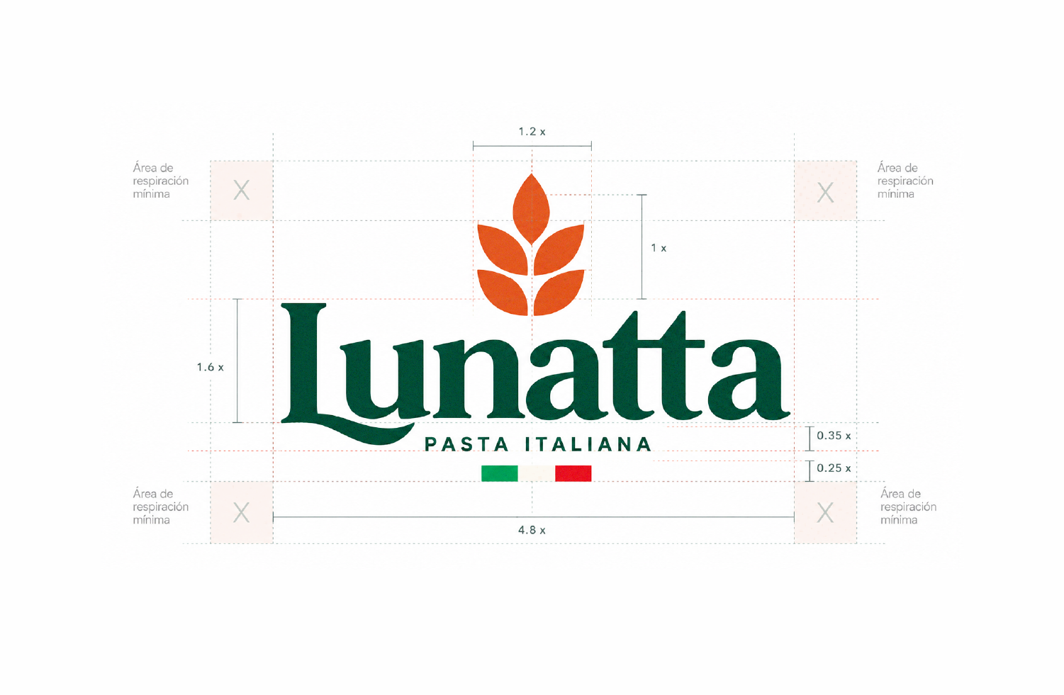
Precision in Craft
A closer look at the geometric balance behind the mark. Every curve, proportion, and spacing was mathematically structured to ensure visual harmony, legibility across scales, and seamless integration onto physical packaging.
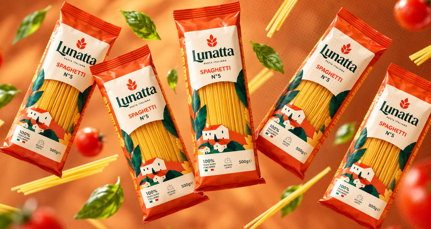
Structural Elevation
Exploring material contrast, finishes, and tactile elements. A dynamic view of the product lineup showcasing the rhythm of the packaging architecture and typographic hierarchy.
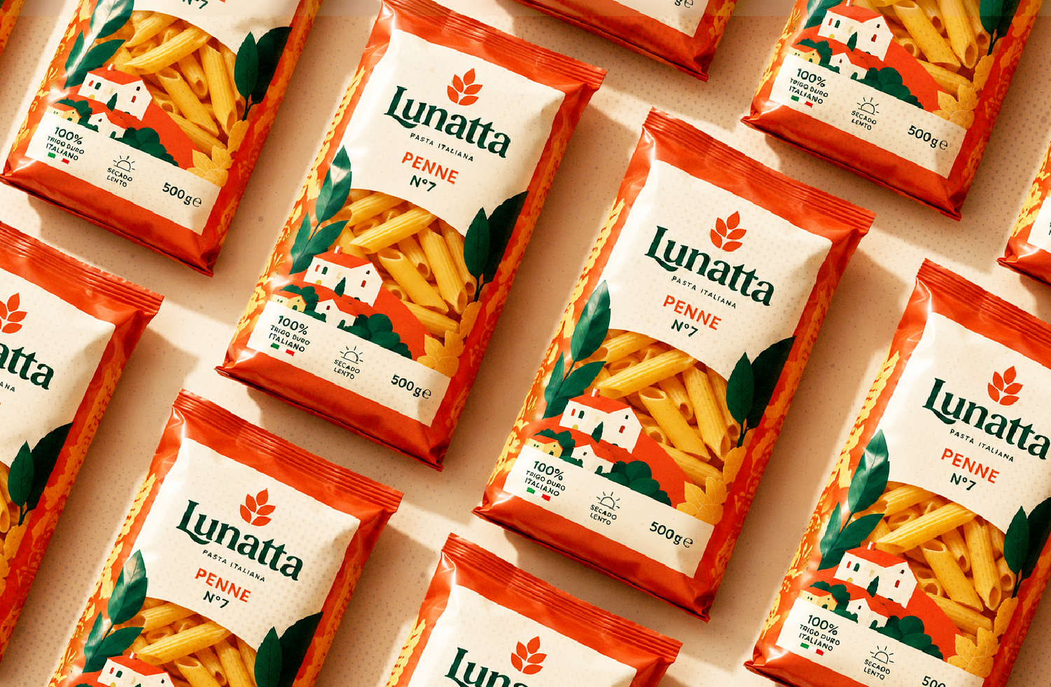
Visual Rhythm
Modularity and visual coherence across production runs. The identity scales into striking repetitive patterns that enhance retail presence and brand recognition.
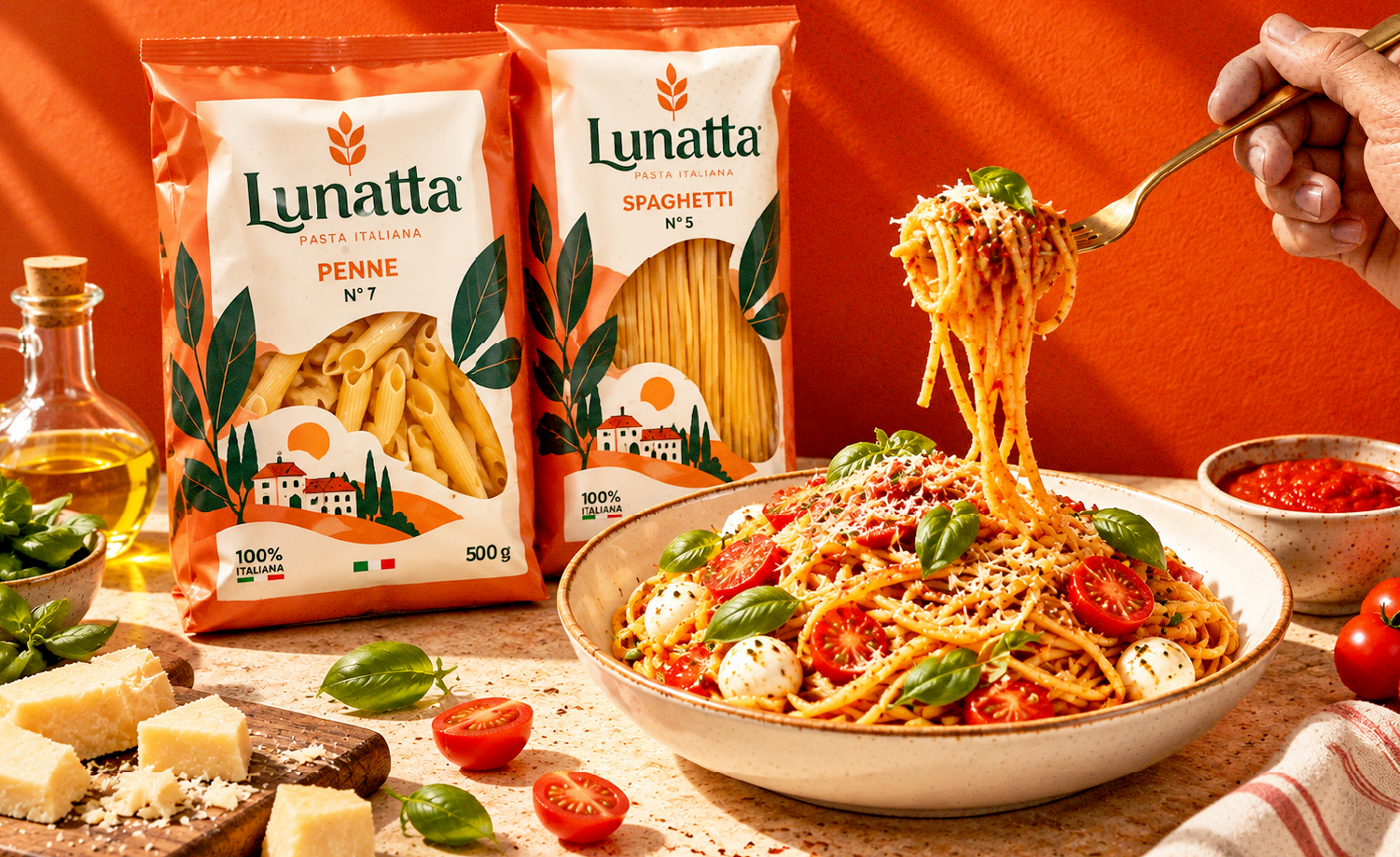
From Grain to Table
Design doesn't end on the shelf; it comes alive in the kitchen. Creating an appetite-driven narrative that connects raw product design directly with sensory culinary satisfaction.
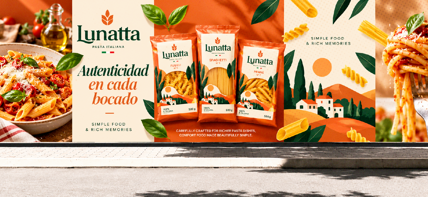
Autenticidad en cada bocado
Large-scale exterior billboard rollout. Translating the warmth of the Mediterranean countryside into bold, arresting street-level communication that drives retail recall.
Graphic System & Assets
A flexible visual language: bespoke landscape illustrations, rustic typography, product photography guidelines, and editorial lockups that form an expansive brand world.
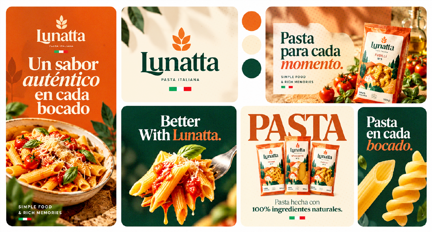
Social Narrative
Engaging content pieces tailored for digital touchpoints, bridging recipe storytelling, product highlights, and community engagement under one cohesive aesthetic.